Connor Boetig

Connor Boetig

Technology and Information Design student at the University of Maryland, graduating May 2027. I like creating systems and making them look good for everyone.

Featured Project

SeatMate

A social connection app designed for the airplane seatback screen

UX Design · 2026

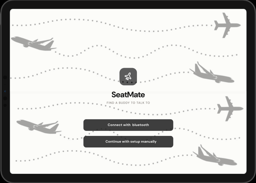
SeatMate landing page mockup showing the app's main screen

Context

Designing connection at 35,000 feet

The assignment was to redesign the airplane seatback screen so passengers could actually communicate with each other, and have it work with the iPhone. The whole thing that got me thinking was how isolating long flights are. You're sitting inches from strangers for hours and there's literally no chill way to talk to anyone. SeatMate turns the seatback screen into an optional social thing where you can find and chat with other people on your flight without it being weird.

Screen Size

The seatback screen is basically iPad sized but the app had to feel like it belonged on an iPhone, so I had to fit iPhone resolution inside that bigger form factor.

Connectivity

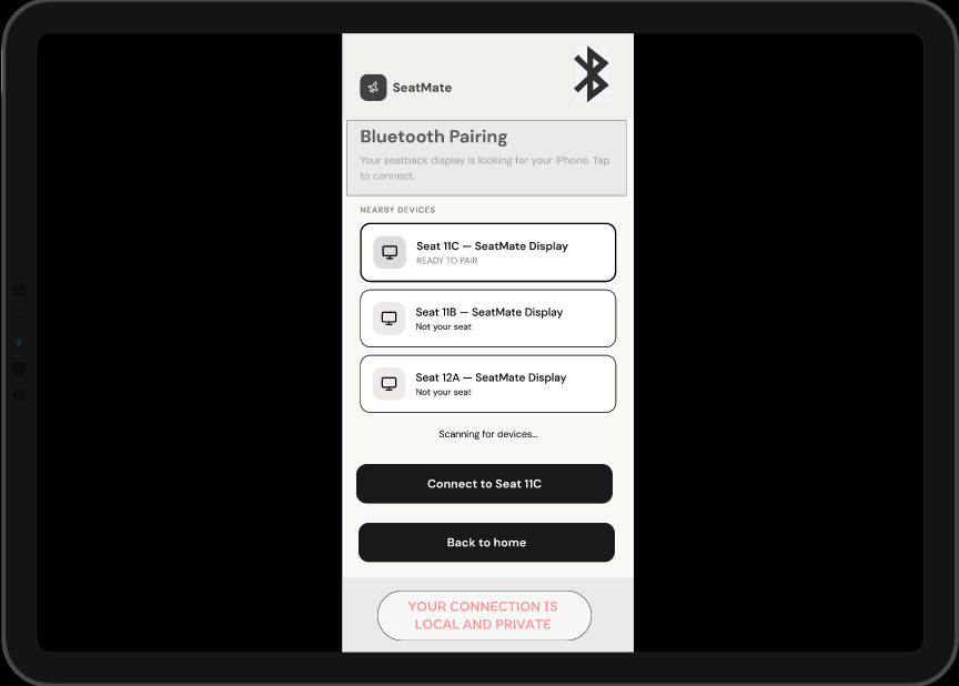
I couldn't assume there'd be WiFi on the plane so the app connects through Bluetooth instead. There's also a manual fallback if someone doesn't have their phone paired.

Participation

Totally opt in. You can go invisible whenever you want. Nobody should feel like they have to participate if they're not feeling it.

Process · Ideation

From wild ideas to a clear direction

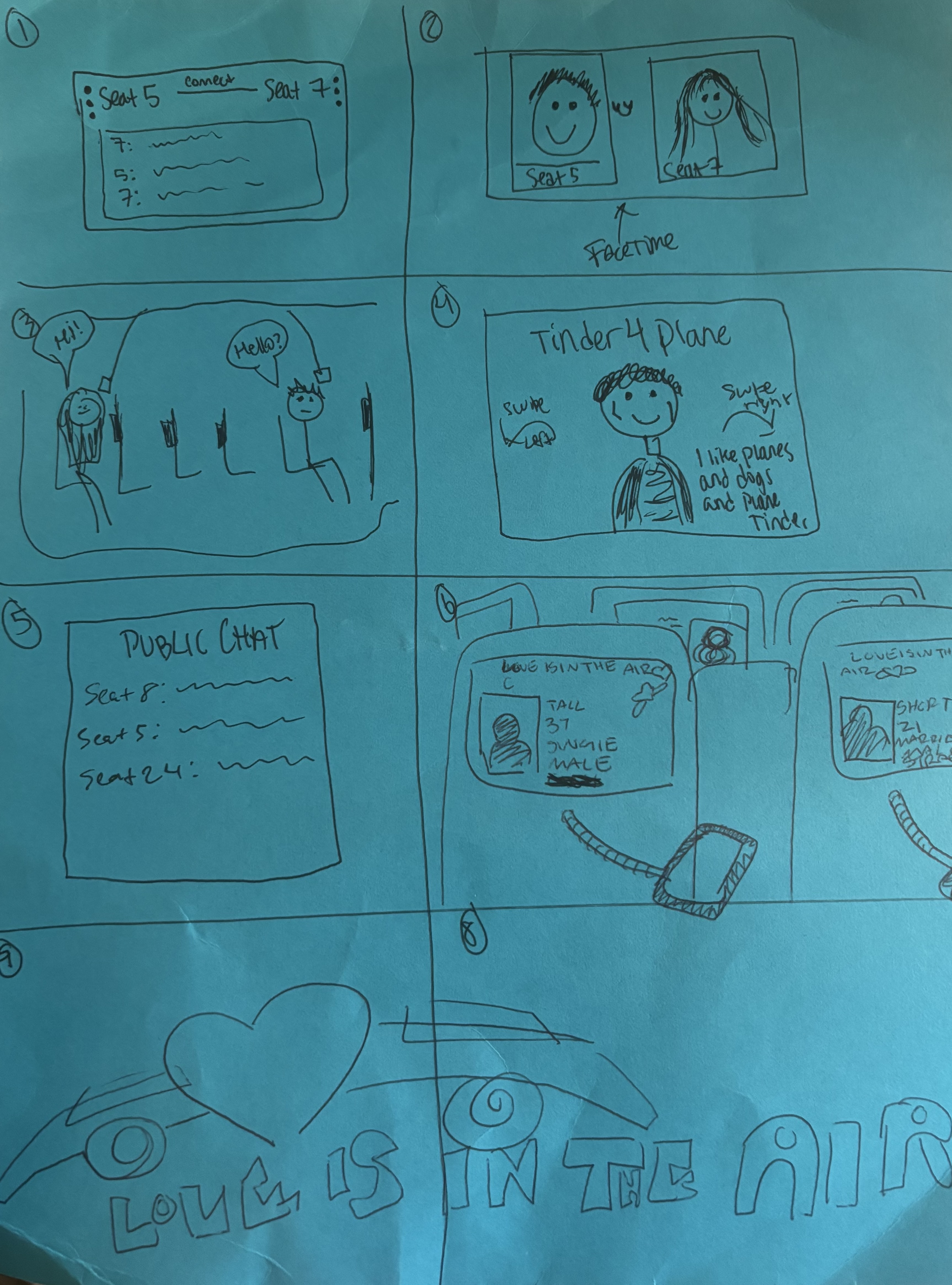
The Crazy 8s brainstorm got pretty out there. I had ideas like phones physically dropping from the seat above you, and a public group chat for the entire plane. Both got scrapped obviously. Way too impractical, way too chaotic. The idea that actually stuck was taking the swipe mechanic everyone already knows and applying it to the people on your flight. Simple, voluntary, low stakes.

Crazy 8s ideation sketches showing early concepts for the seatback screen app

Process · Iterations

Three rounds. One clear direction.

A1 Paper Prototype

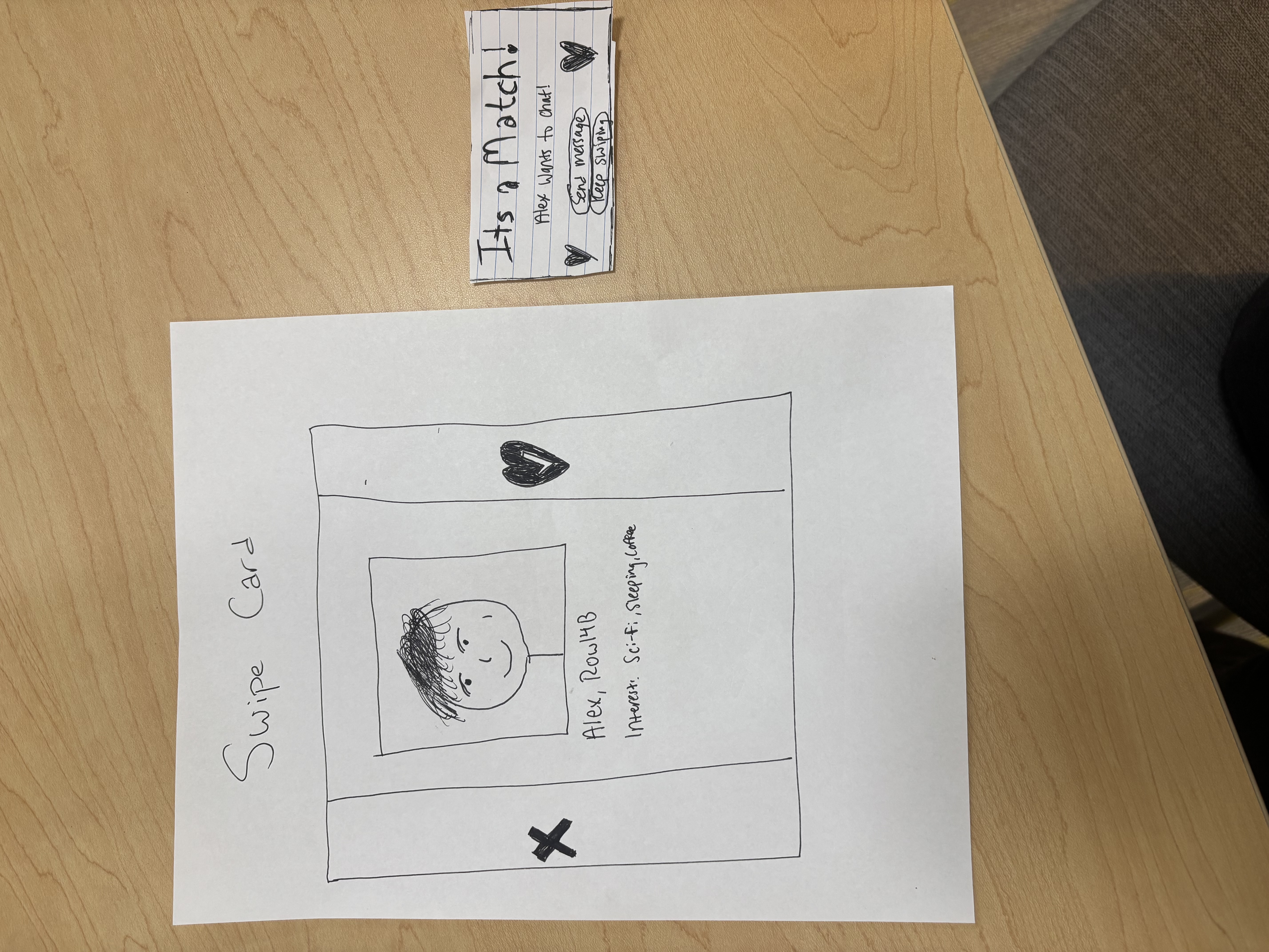
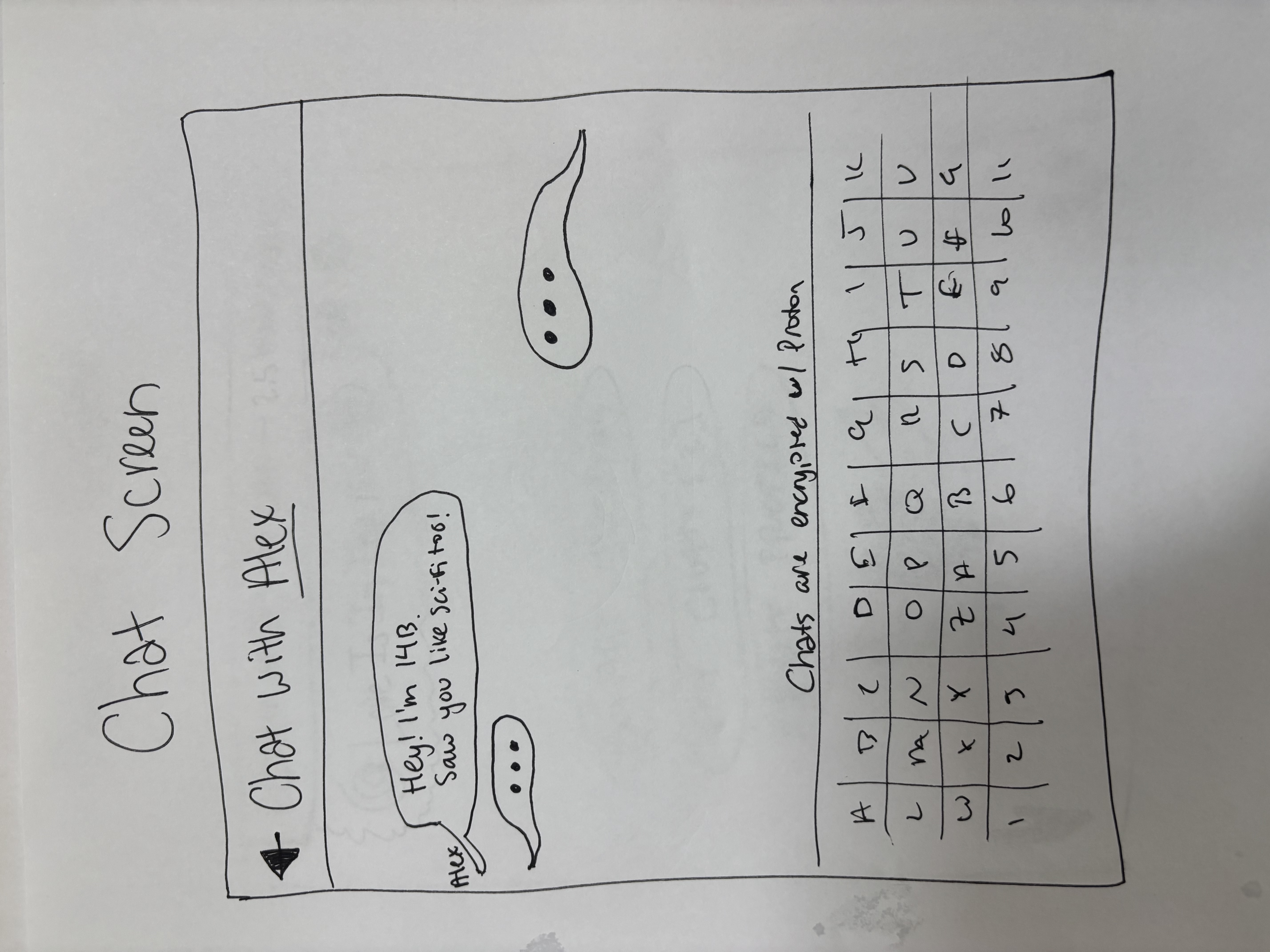
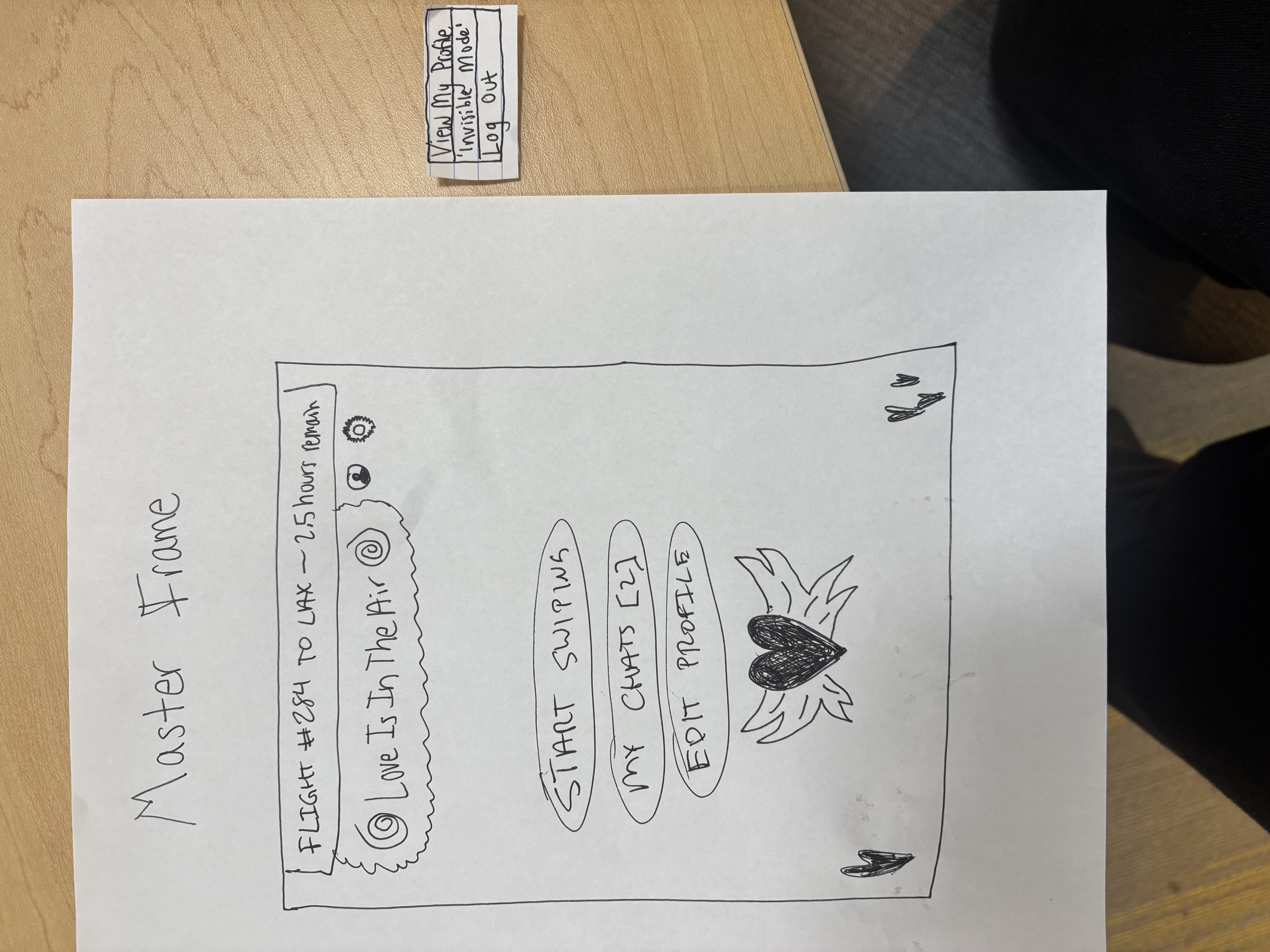
A1 paper prototype, swipe card screen A1 paper prototype, match popup screen A1 paper prototype, chat screen

First paper prototype with just a swipe card, match popup, and chat screen. I originally called it "Love Is In The Air." Only 3 screens, one flow, no real navigation.

Feedback was to add more screens, flesh out the swipe card, and figure out navigation.

A2 Mid-Fi Paper Prototype

Renamed it to SeatMate. Added a bottom nav bar with icons and labels. Made the swipe card show age, interests, and seat number. Got rid of the hand drawn keyboard in the chat screen since people would obviously just use their phone's keyboard.

Feedback was that the concept was coming through better but it needed more airplane theming and the navigation still needed work.

A3 First Figma Prototype

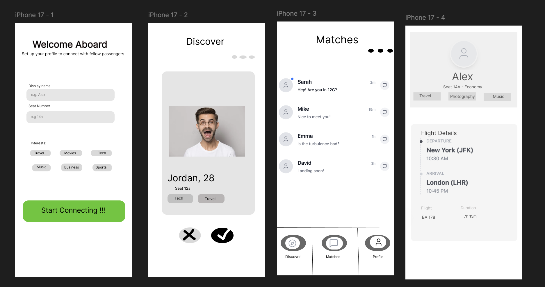
A3 first Figma prototype showing Welcome, Discover, Matches, and Profile screens

First time using Figma and honestly it was rough. I built 4 screens for Welcome/Onboarding, Discover, Matches list, and Profile. The execution was messy but all the core flows were actually wired up and working.

Feedback was to add airplane theming, clean up the UI, make the match popup better, and add a Bluetooth onboarding flow.

Process · Decisions

Decisions that shaped the final design

Renaming the app

"Love Is In The Air" was a funny name but super confusing. When I watched someone actually try to use the prototype it was immediately obvious the name wasn't getting the point across. SeatMate just makes more sense. It's direct, memorable, and you instantly know what the app does.

Labeling nav icons

Icons by themselves just aren't clear enough. Not everyone knows what a random silhouette icon means. Putting text labels under each nav icon made the whole app way more usable for everyone, not just people who already know app conventions.

Seat number on swipe cards

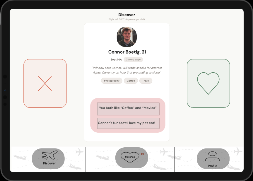
Putting the seat number on each person's card makes it feel so much more real. You're not just swiping on random people from who knows where. You can see exactly where they're sitting on your actual flight.

Final Outcome

SeatMate. Find a buddy to talk to.

The final prototype pulled together everything I learned across three rounds of iteration. It's got a clean Bluetooth onboarding flow, swipe based passenger discovery, private in seat messaging, and an airplane themed look throughout. You can always go invisible if you're not in the mood.

SeatMate Bluetooth onboarding screen

Bluetooth Onboarding

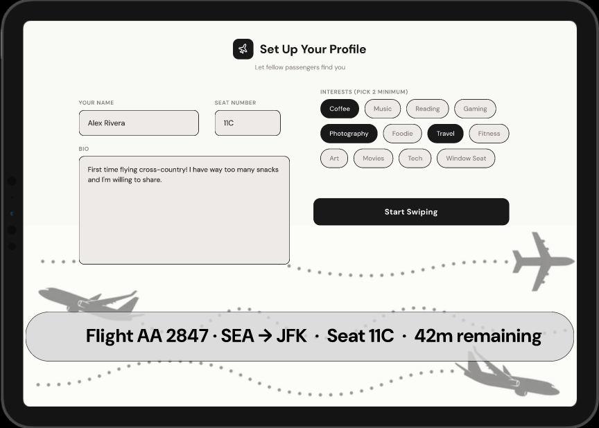
SeatMate profile setup screen

Profile Setup

SeatMate discover and swipe screen

Discover / Swipe

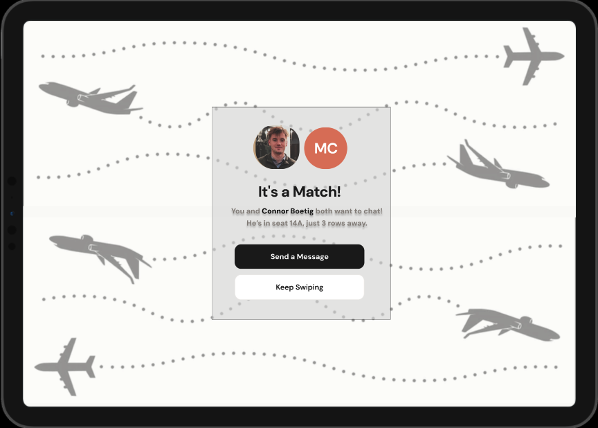
SeatMate match confirmation screen

It's a Match!

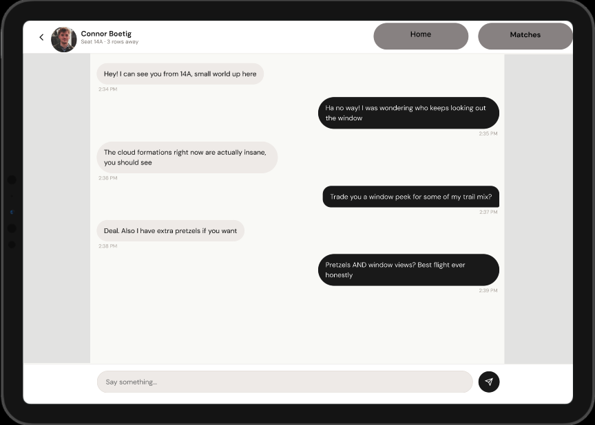
SeatMate private chat screen

Chat

SeatMate landing page screen

Landing Page

How it works

You pair your iPhone over Bluetooth, set up a quick profile with your name, seat number, and interests, then browse other people on your flight. If you both swipe on each other it opens a private chat. The bottom nav has Discover, Matches, and Profile so you always know where you are.

Why it works

It tackles the whole isolation problem on long flights but in a chill, no pressure way. Nobody is forced to participate.

The swipe thing means there's basically no learning curve. If you've ever used a social app before you already know how it works.

Seat numbers on every card make it feel grounded and real. You know exactly where someone is sitting on your actual flight.

Bluetooth means no WiFi needed. The app just works in the air without depending on airline internet.

I thought about accessibility the whole time. High contrast, big tappable buttons, labeled nav icons, and shapes that don't rely on color alone.

Reflection

What I learned

Figma is a legit skill on its own. Jumping in mid project was humbling but being forced to figure it out fast meant I actually grew a ton between A3 and A4.

Watching someone use your prototype is completely different from just looking at it yourself. When a classmate tried "Love Is In The Air" for the first time the name problem was obvious within seconds.

The feedback I got actually improved as the project went on. By the end people were giving really specific and actionable critiques instead of just saying "looks good."

Accessibility stuff makes things better for literally everyone. Labeled nav icons, high contrast, shape redundant buttons. These aren't edge case fixes, they're just better design.

What I'd explore next

Making the interest tags interactive so you can toggle them on and off instead of them being static

Some kind of notification system for new matches and messages

Dark mode because why not

Getting more advanced with Figma and prototyping earlier in the process

INST367 · 2026 · Team Project

Better Terp

A Canvas redesign for UMD students. Mobile-first. Built by a team of four.
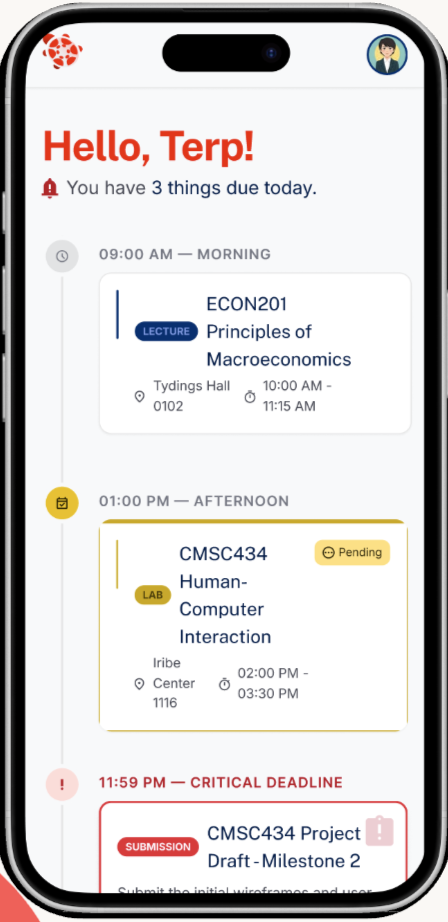
Better Terp dashboard mockup, the Hello Terp welcome screen with today's timeline

The reality of being a UMD student

0+

courses every semester.

~0%

confidence in the Canvas calendar.

Every student we talked to keeps a backup system. A separate calendar, a Notion doc, a screenshot folder. Canvas alone doesn't earn the trust to be the one place they check.

Context

Fixing Canvas without breaking what works

The assignment was to redesign a service people actually use and we picked Canvas. Everyone at UMD has to use it. Pretty much everyone has something they complain about. Our team (me, Aayusha, Nahjah, and Brian) spent the second half of the semester pulling out what's actually frustrating about Canvas and turning those fixes into a design. We called it Better Terp.

Mobile first

The Canvas mobile app is where students hit the most complaints, mentioning calendar bugs, missing features, and repeated logins. If we fix the phone experience, students will actually use it.

5+ courses at once

Nobody we talked to was tracking just one or two classes, it was always 5 or 6. The design had to account for this with purposeful UI.

Trust over flash

Our interviewed students mentioned keeping a separate calendar or Notion doc because Canvas tends to miss details. The redesign had to actually be trustworthy and not just look nicer.

Process · Research

What students actually said

Before sketching anything we interviewed each other. What kept coming up is nobody actually uses Canvas the way Canvas wants, everyone seems to have their own workaround. We synthesized everything we heard into an affinity map and three themes fell out.
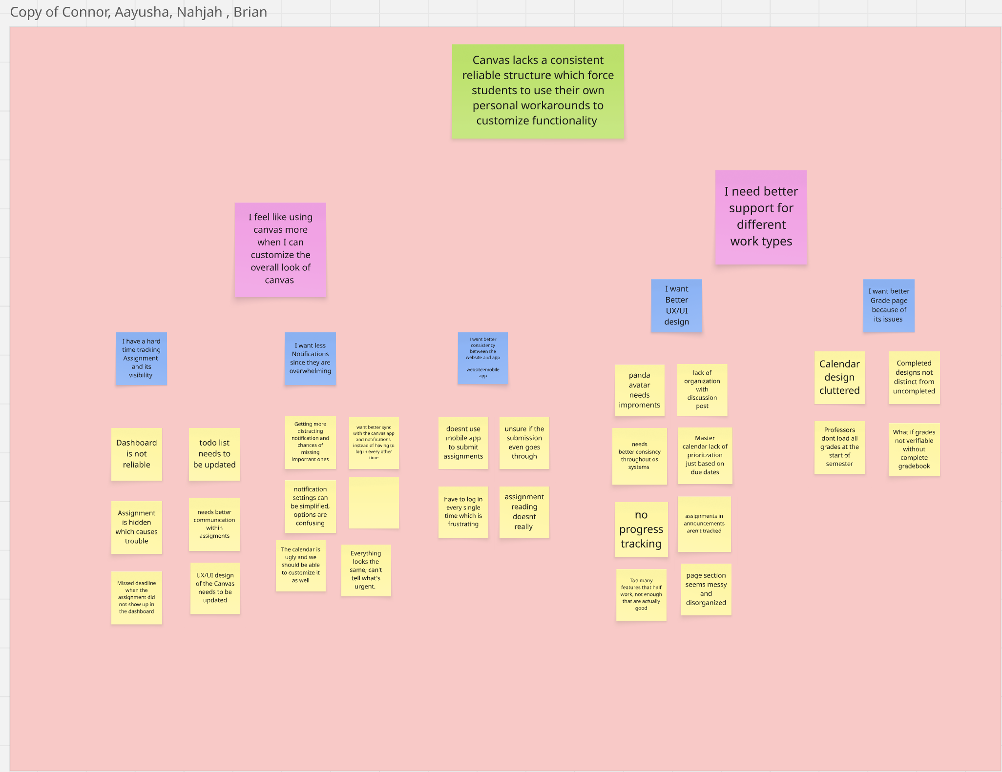
Affinity diagram from user interview synthesis, grouping student frustrations into themes

Theme 1

No consistent structure

Every professor organizes their course page differently. Finding work turns into a treasure hunt every single time.

Theme 2

Surfaces that should help, don't

Dashboard, calendar, to-do list, notifications. All of them have gaps that push students to external backup systems.

Theme 3

Mobile is second-class

Repeated logins, missing features, sync issues. Students avoid the app and use Safari, which means Canvas is even less reliable.

The pattern that hit us

Canvas isn't broken
in one big way.

It's broken in a hundred small ones.

Every student we interviewed had a personal workaround. Notifications turned off. Calendar bypassed. Mobile app skipped. Same complaint, a hundred different shapes.

Process · Ideation

From whiteboard to final submission

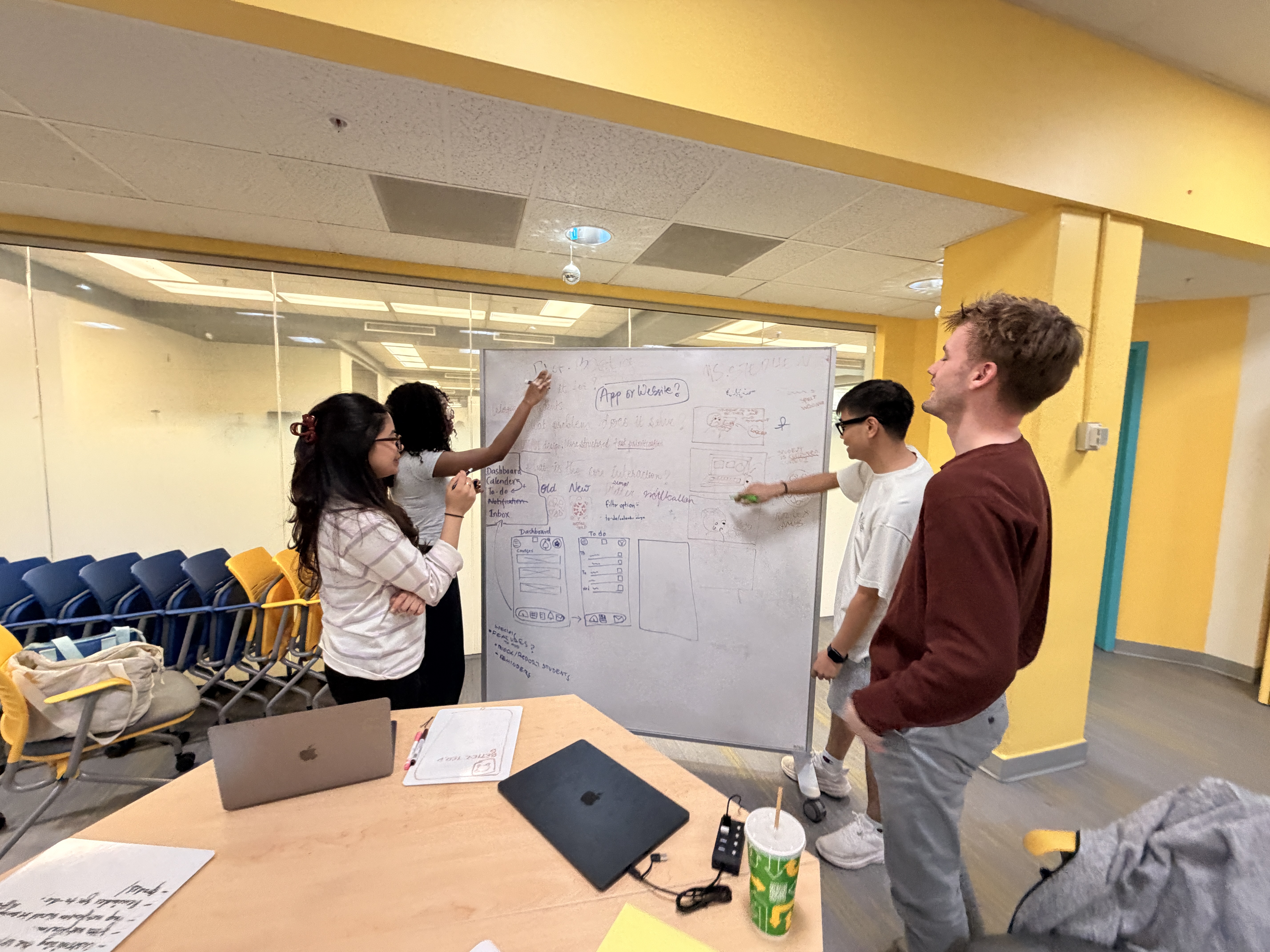
We started with a whiteboard brainstorm. Most of the early ideas were just better versions of Canvas tabs. But we realized instead of organizing by course like Canvas or by deadline like a calendar app just organize by what you need to do right now. A to-do list as the front door and everything else feeding into it. Once we had that the rest of ideation flowed much easier.
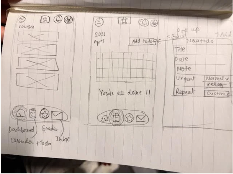
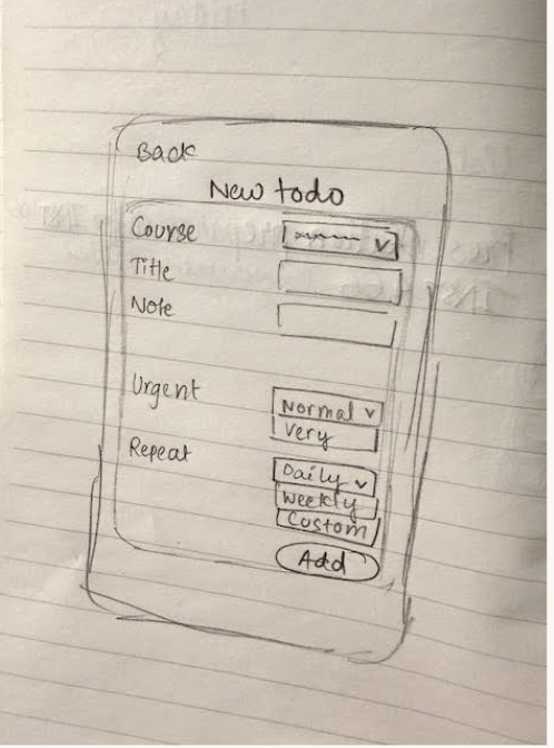
Paper sketches from the team's ideation session
More paper sketches exploring layout and todo flow
The team working at a whiteboard during ideation

Process · Iterations

Three rounds. Mid-fi to high-fi.

B4 · Mid-Fi

Our first prototype

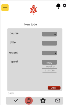
B4 gray-box mid-fidelity wireframe screen

A gray-box mid-fi to test the flow before doing any visual design. Five screens. Welcome and sign-in. A dashboard with an empty state. Courses list. New-todo form. Profile. No branding yet. Just structure.

B5 · User Testing

Watching real students try it

We watched students walk through the mid-fi prototype and say "okay what do I do" out loud. The layout landed clean and the navigation made sense. But a few things broke immediately. Nobody could tell what nav icons meant. Course codes meant nothing without checking your schedule. And there was no due date or time on any todo, which we knew right away we had to add.

Simplicity works but students need due dates to actually trust the app. The mid-fi proved the structure, then in the high-fi we built off that to gain trust.

B6 · High-Fi

Real visual design, every fix applied

B6 high-fidelity prototype dashboard with full visual design

Final prototype with full visual design. Red turtle. Brand colors. Real screens. Every issue from B5 got fixed. Due date and time on every todo. Full course names instead of codes. Auto-sort by due date with urgency tags. Labeled nav icons. This was a great improvement.

Process · Decisions

Decisions that shaped the final design

1

Due dates and times on every todo

The biggest miss in mid-fi was treating todos like titles with categories. The second a tester tried to add one they asked "okay but when's it due?" Adding due dates ended up being the biggest change between mid-fi and high-fi.

2

Course names instead of course codes

"INST367 Prototyping and Development Studio" instead of just "INST367." Testers couldn't match codes to classes especially with five or six going at once. The longer name eats more space but you instantly know which class it is. This is something I struggle with, I was suprised to see I couldnt see that to begin with.

3

Labels on every nav icon

Same lesson Project A taught me. A clipboard icon could be a to-do or a notes app or a checklist. A text label under each icon takes a few pixels and just makes it obvious.

4

Default sort is "what's due first"

Auto-sort by due date with the most urgent thing at the top. People said they trust the app more when it does the sorting instead of making them drag stuff around.

5

A dashboard that leads with what's next

Instead of dumping every assignment the dashboard opens with "You have 4 things due today" and a timeline. The point is to kill the "wait what am I missing" feeling students get when they open Canvas in the morning.

The outcome

Better Terp.

One place students can actually trust.

All of Canvas, condensed into a few main screens you'll actually open.

Final Outcome

Four screens, one consistent system

The final prototype effectively covers almost everything students open Canvas for. Same look and same nav across every screen. Something Canvas itself never pulled off.

1 / 4

Dashboard

"Hello, Terp." A time-sorted timeline of what's due today, color-coded by urgency. The first thing students see when they open the app.

Better Terp dashboard screen with today's timeline
2 / 4

Grades

Course-by-course performance with quick callouts like top performer and improvement area, plus a semester GPA summary at the bottom.
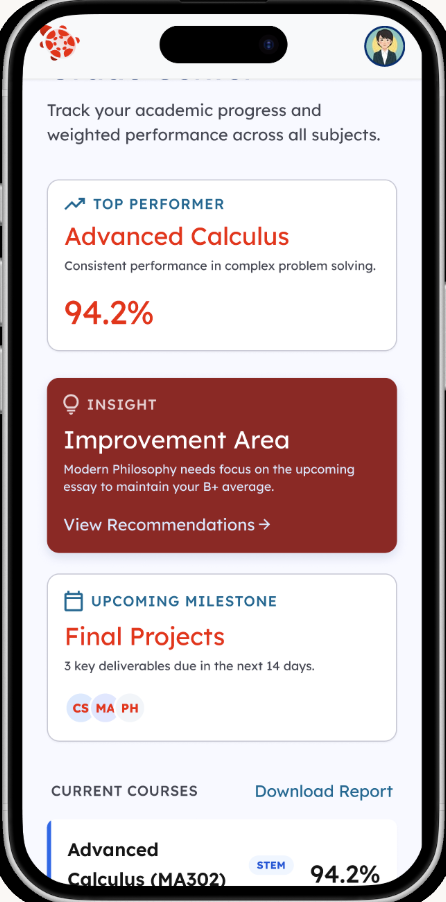
Better Terp grades screen with top performer and improvement area
3 / 4

Calendar

Monthly view with class periods and deadline markers, plus today's agenda underneath. The longer-horizon view for when you need to plan.
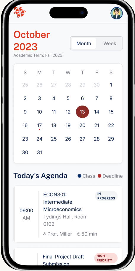
Better Terp monthly calendar with today's agenda
4 / 4

Notifications

Grade alerts filtered by course with the option to mute by category. The fix for Canvas dumping every announcement and comment.
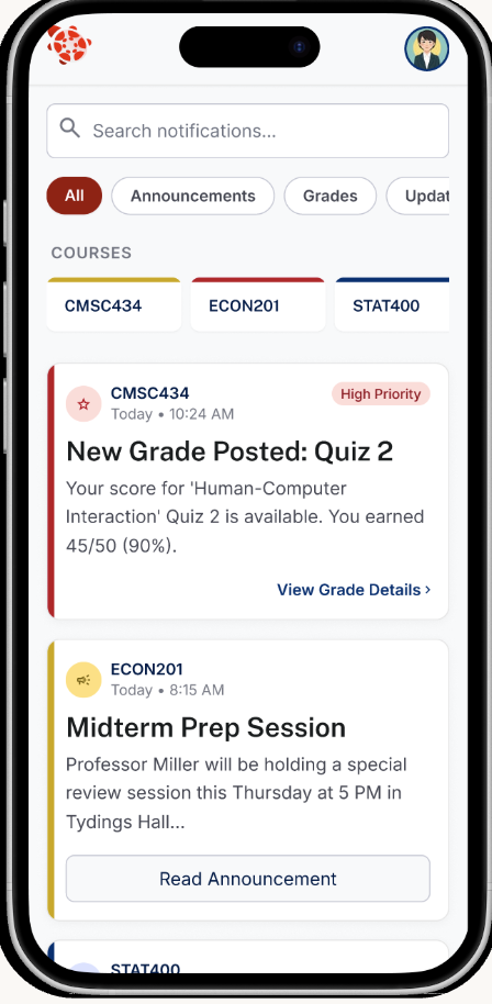
Better Terp notifications screen with grade alerts

How it works

You sign in once with your UMD credentials and the app remembers you. No more logging in every five minutes. The dashboard is the first screen you see. It shows what's due today in time order so you always know what's next. Bottom nav gets you to Grades, Calendar, and Notifications and they're all labeled. Every screen uses the same layout and urgency colors so once you've figured out one you've figured them all out.

Why it works

It cleans up the scattered Canvas mess into one place that actually feels consistent.

Time-based sorting kills the "what's urgent" guessing students do in their heads every morning.

Course names everywhere so you don't have to translate codes in your head.

Labeled nav and color-coded urgency on every screen. The part Canvas itself most fails at.

Built around the to-do list because that's the one Canvas feature every student we talked to already trusts.

Reflection

What we learned

Listening across four students

From user testing and interviews, students kept giving us different versions of the same complaint. Canvas isn't broken in one big way. It's broken in a bunch of small ways and every student has built their own patches around it. The affinity map was where that pattern showed up.

Gray boxes hide content problems

Mid-fi gray boxes catch flow problems but they hide content problems. We didn't realize "no due date field" was a miss until a tester tried to actually use it and asked "okay but when's it due?"

Course codes are obvious until they aren't

Course codes seem obvious until you're not in the class. Designing for someone juggling five or six courses meant assuming nobody can instantly map "INST454" to "Project Development Studio."

A team of four is its own design problem

Working on a team of four was way different from doing Project A solo. Decisions took a bit longer because everyone had opinions, but the design was more thought through and solid with 4 eyes on the same problem.

What we'd explore next

Actually wiring it up to the Canvas API so todos pull from real assignment data instead of mock data.

A standardized course page template that professors actually use so the structure problem gets fixed at the source.

Customizable push notifications that only fire for urgent things and not every announcement and grade and comment.

Built for INST367, Spring 2026.
FlushFM title card with team names

INST406 · 2026 · Final

A reporting system for bathroom issues across UMD academic buildings. Built over four months by a team of five.

The Problem

Bathroom problems don't get fixed quickly, and you usually never hear back.

Picture a sink in the Sociology building that's been scalding hot for weeks. Students reported it, but nothing changed. We didn't actually witness that exact one, but it's the kind of thing that almost certainly happens somewhere on campus any given week.

Almost every UMD bathroom has something broken at any given moment. The current way to report a problem is to find Facilities' email or phone number, write the issue up, and hope it lands with someone who can fix it. There's no confirmation, no progress, no accountability. So most students don't bother.

Students don't bother reporting because it feels ineffective, and Facilities has no real timeline holding them to a fast response.

The dual incentive problem

Research

What we needed to figure out:

Q1

How do we get students to actually report problems, and get Facilities to act on them quickly?

The dual incentive problem. Students don't bother because reporting feels ineffective, and Facilities operates without a strict timeline, so action can be slow. Both sides need a reason to engage.

Q2

How do we design something that works for everyone walking out of a bathroom?

Some students are sprinting and have ten seconds, some have time to fill out a form. Some can use their hands easily and some can't. The reporting design had to be accessible and account for everyone.

Iteration

From a sketch on paper to something we'd actually mount on a wall

The button-and-QR poster went through four iterations. Each one solved a problem the previous one had.

First Prototype

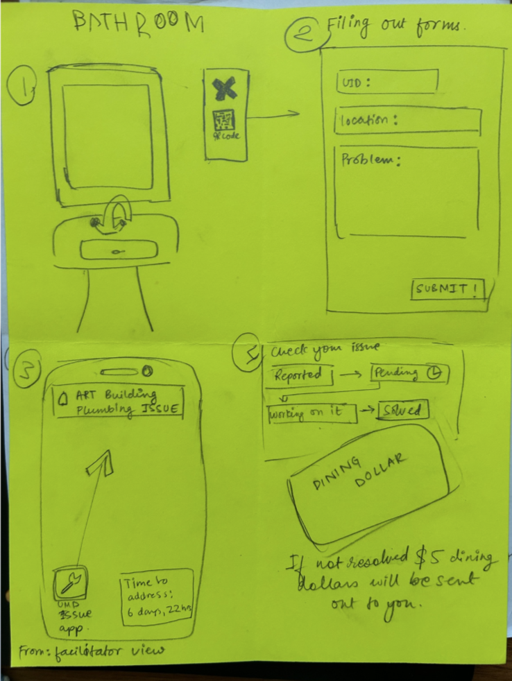
First paper prototype with X-shaped button

X-shaped button, QR underneath. We debated whether the QR should even be there since the button alone could trigger a report, but without a form Facilities would have no idea what was wrong, so we concluded on keeping the QR code.

Second Prototype

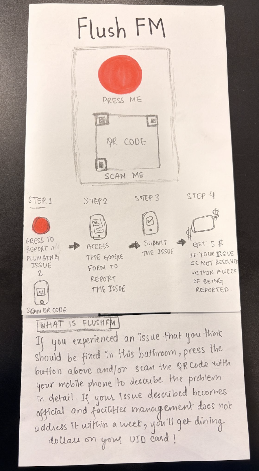
Second paper prototype with red circular button

Red circular button, with PRESS ME and SCAN ME clear and obvious. We were happy with how the layout was coming together, and the structure carried into the digital version next.

Third Prototype

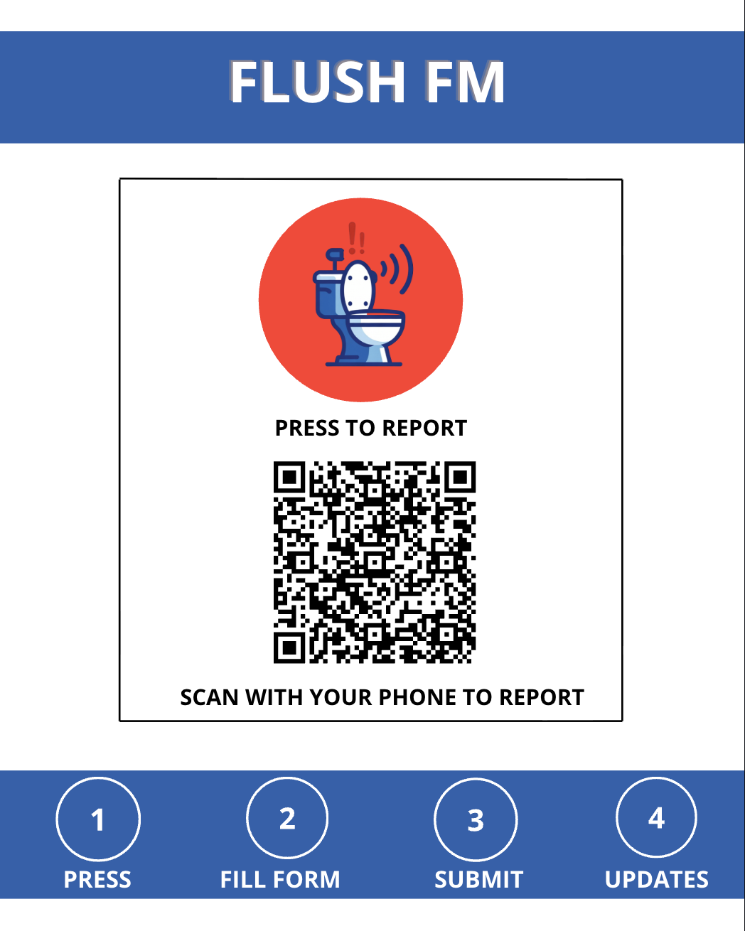
Digital red button prototype with numbered steps

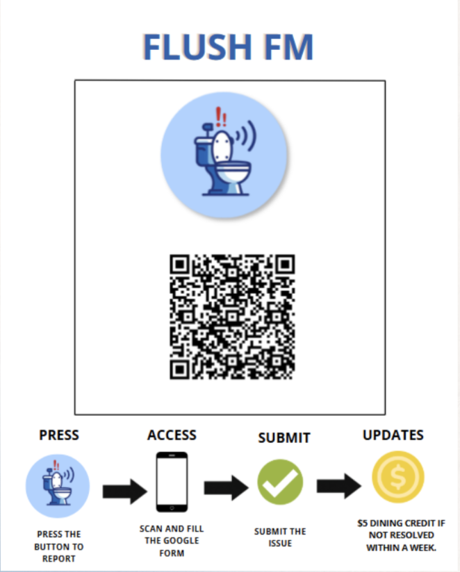
First digital version. Cleaner red button, the QR sized down, and a footer strip with the four steps (press, fill form, submit, updates) so users know what they're getting into.

Final

Final action poster mounted on bathroom wall

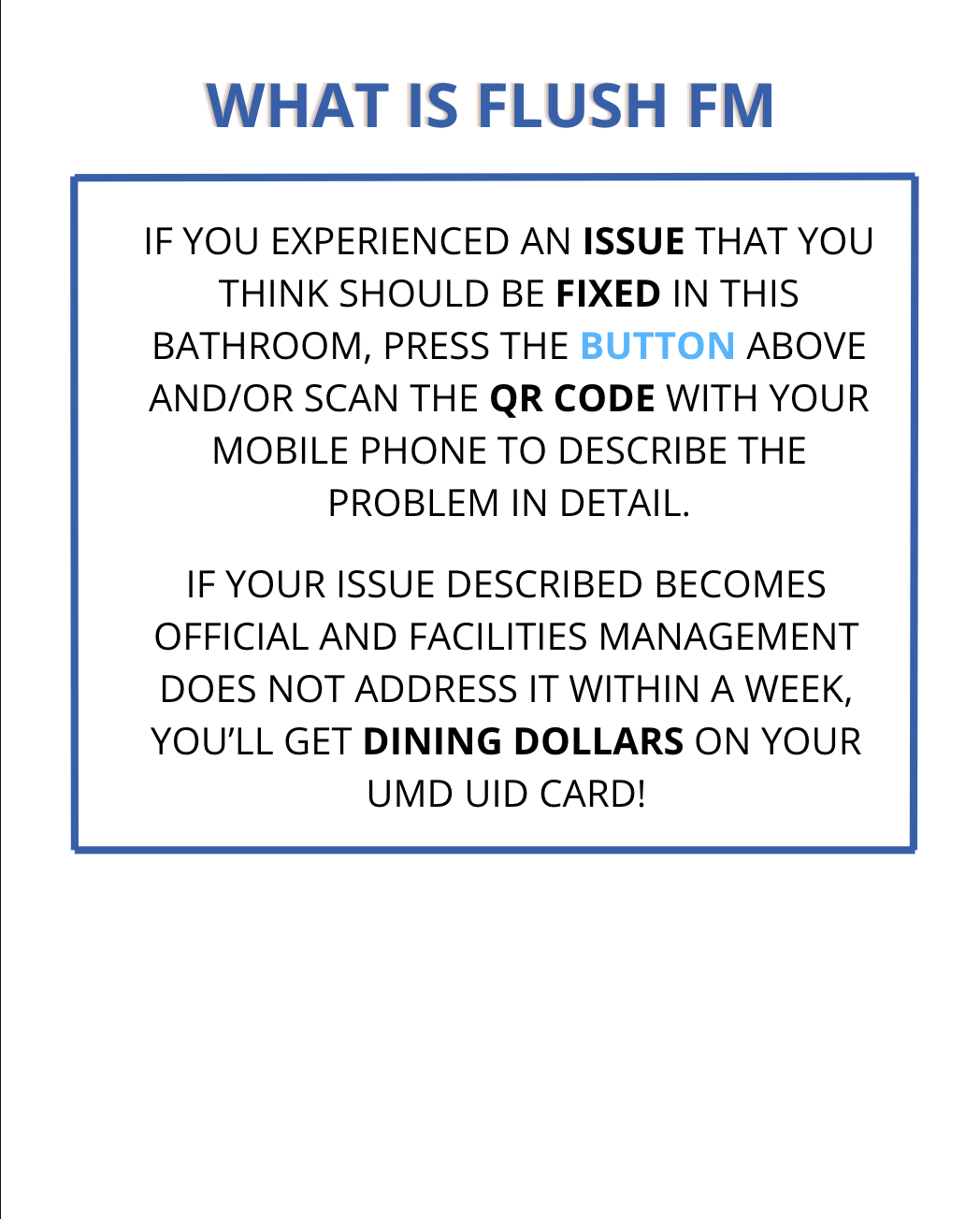
Blue button, mounted on the wall. The descriptive text got pulled off the action poster and onto a second poster right next to it. The action poster got reduced to symbols, arrows, and two labels.

What is FlushFM explainer poster with descriptive paragraph

The explainer

A second poster doing a different job

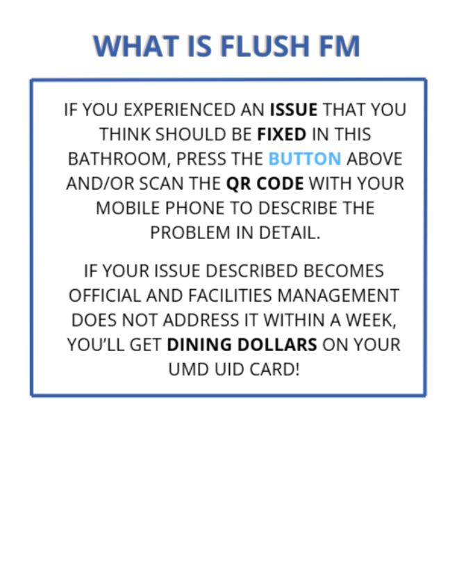
Sitting next to the action poster, this one tells you what FlushFM actually is, what happens when you report, and how the dining-dollar incentive works. Students who are in a hurry can skip it and just hit the button, and students who want context can read it and understand the whole system before they engage.

The smallest change that mattered

Red said emergency.
Blue said report.

Emilie pointed out that red felt like a fire alarm. Pressing it felt like activating something serious, which is the opposite of what reporting a broken sink should feel like. We changed it to blue, and the whole interaction relaxed.

User Testing

What broke when real people tried it

We brought the second prototype to our TA, Emilie. She gave us a lot of insightful feedback with fresh eyes, and much of it had us rethinking our design, even decisions we thought were airtight.

Finding 1

The two paths felt like one decision

Emilie asked why the button was there if she was already scanning the QR. From the outside it read as two solutions to one problem instead of two paths for different time budgets.

Finding 2

The red button felt like an emergency

Emilie paused before pressing it. Red read as fire alarm, not as "tap to report something." We learned pretty fast that what we thought was visual clarity was actually overselling urgency compared to what was going to happen on the other end.

Finding 3

Nobody wants to press a button in a bathroom

Emilie said she didn't want to touch a button in a public bathroom after washing her hands. Professor Lutters told us the same thing. Hygiene is part of the design and we hadn't factored it in enough.

Finding 4

The form was easy but the answers were thin

Everyone knows Google Forms, so Emilie filled it out fine. But "sink is broken" doesn't tell Facilities whether it's hot water, low pressure, or a leak. The form needed to ask for specifics.

Finding 5

The email status was good but buried

Emilie liked knowing where her report was, but didn't like reading through a whole email to find out. She wanted to glance at her inbox and know without opening anything.

The System

Four pieces working as one product

The final design is four pieces that each do their own job and pass to the next one: a poster gets you in, a form takes the details, an email keeps you updated, and a payout keeps Facilities honest.

1 · Physical interface

Action poster + explainer

Action poster mounted on bathroom wall
Explainer poster mounted next to the action poster

People in a hurry hit the button or scan the QR. People who want context read the wall sign next to it. The split was the single biggest change between V3 and V4.

2 · Google Form

Slow path. For people who have a minute.

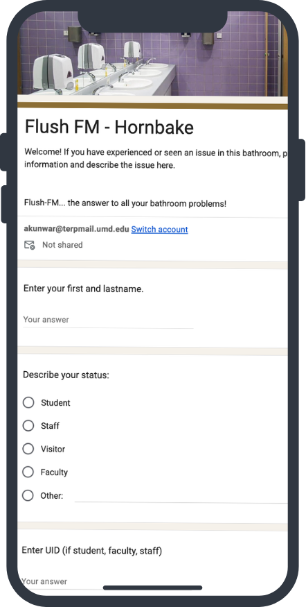
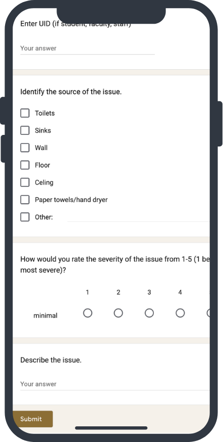
Triggered by the QR. Asks for the building, the issue type, severity, and your UMD email and UID if you want to be eligible for the payout. Most people include them.

3 · Email tracking

Status in the subject line

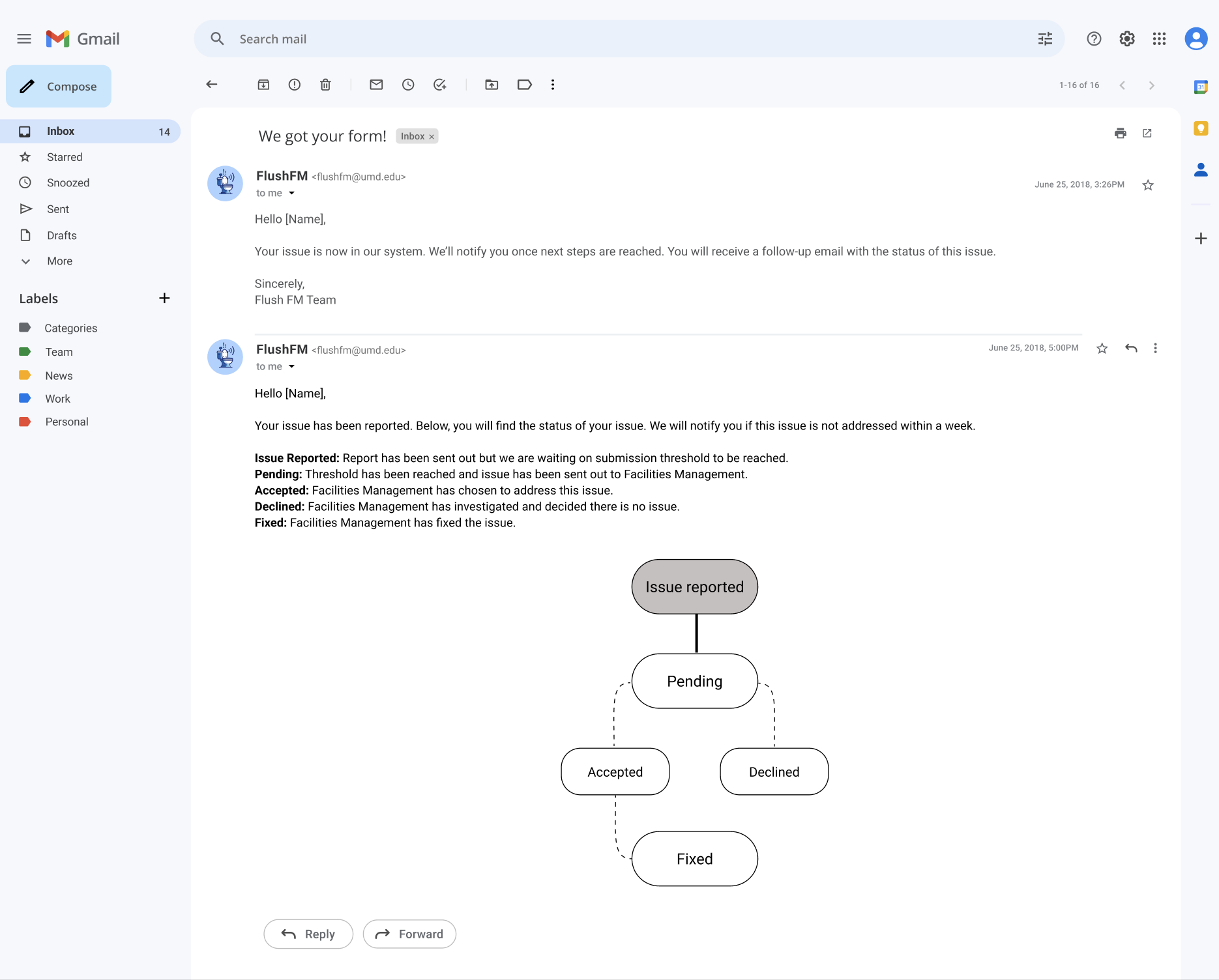
Every status change updates the email subject so you can scan your inbox in one second. Inside the email, a Domino's-style tracker shows you where in the pipeline you sit.

4 · Dining dollar payout

The accountability lever

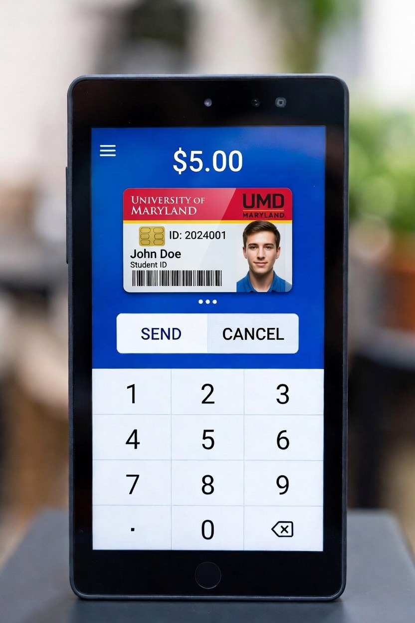
If Facilities hasn't accepted or declined the report in a week, every reporter who included their UID gets $5 added to their UMD card. Without this piece, FlushFM is just another form that gets ignored.

Walkthrough

What it looks like to actually use it

1

Scan the QR on your way out

You see the poster as you leave the bathroom, pull out your phone, and scan the QR code. The form opens. No app to download, it just opens in your browser.

2

Fill the form

Building, issue type, severity, your UMD email and UID. The whole thing takes under a minute. Familiar Google Forms layout means almost no one bounces.

First half of the Google Form
Second half of the Google Form
3

Get a confirmation

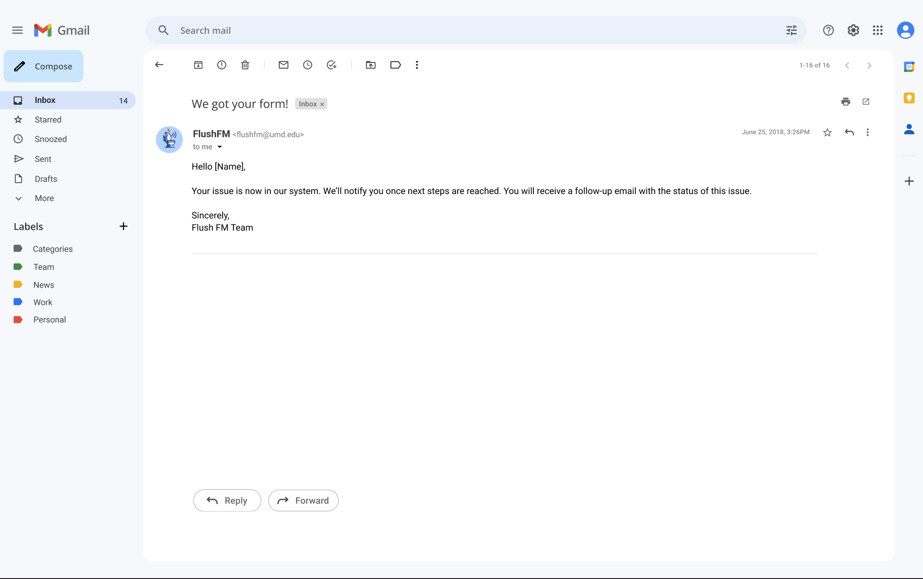
An email lands in your inbox right away. The subject line says received, and the body explains what happens next so you don't have to wonder if anything got logged.

Confirmation email after submitting the form
4

See the status in your inbox

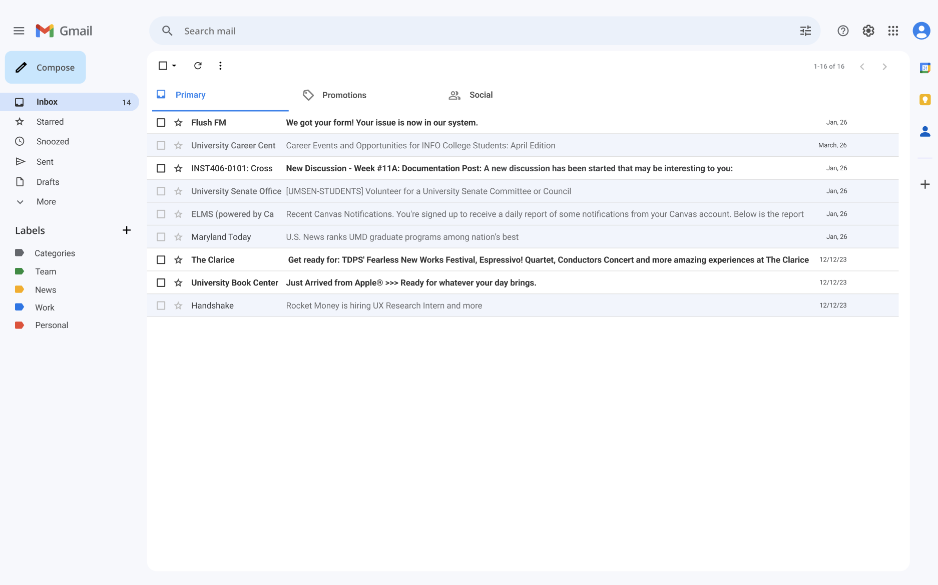
Every status update changes the email subject: 1- Reported, 2- Pending, 3- Accepted, 4- Declined, 5- Fixed. You can look at your inbox and know exactly where your report sits without opening anything.

Gmail inbox view showing FlushFM status in subject line
5

Open the email, see the pipeline

Inside the email is a tracker that looks like the Domino's pizza tracker. Five stages laid out left to right. Whatever stage you're in is highlighted. No reading required.

Status tracker visualization inside an email

The accountability lever

$0 dining dollars.

If Facilities hasn't accepted or declined your report in a week, every reporter who included their UID gets $5 on their UMD card.

Small enough that the school can absorb it, big enough that students will actually report. This is the piece that makes the rest of the system work.

UMD student card showing $5 dining dollars added

Reflection

What this semester taught us

Designing around a system we couldn't see

It's hard to design into a system you can't see. We tried to interview the UMD Facilities coordinator and she didn't respond, and when we tried to drop in we missed her. So we built FlushFM on top of Facilities' existing email tools instead of plugging into whatever they run internally. Honestly, that's probably more realistic than what we would have built with full access. Real products usually don't get to redesign systems they integrate with.

Color is content

Changing the button from red to blue wasn't a styling choice, it was more of a meaning choice. Red was telling users this is an emergency, don't touch unless something is on fire. Blue let the same button mean tap here if you saw something broken. Same shape, same size, same position, totally different message. Emilie was the one who flagged this, and without her user test we would have shipped with the red button still in place.

Hygiene matters more than we thought

Emilie's point about not wanting to press a button in a bathroom is the kind of thing you only get from putting prototypes in front of real people. Professor Lutters told us the same thing in review, which confirmed this wasn't just one person's preference, it was real feedback we needed to act on. We almost shipped a system whose central interaction the user would have actively avoided, and the elegance of "tap the button" doesn't matter if nobody wants to tap the button.

What five of us pulled off in a semester

Building this across a semester with five people meant ideation sessions, role splits, writing handoffs, and prototype handoffs at every step. Every decision got sharpened by four other perspectives. The system we shipped is way stronger than what one or two of us would have made solo, and there's no version of this project where any one of us catches the hygiene point alone.

What's next

One thing we didn't solve

A single UMD campus-wide report threshold doesn't work because bathrooms get wildly different traffic. A library bathroom and a quiet classroom-building bathroom can't share the same trigger or the system over-fires on one and under-fires on the other. The threshold has to be tuned per bathroom, and we didn't have time to figure that out. The first thing we'd do next is actually install FlushFM in real bathrooms across campus, watch how each one reports, and tune the threshold from real data instead of guessing.

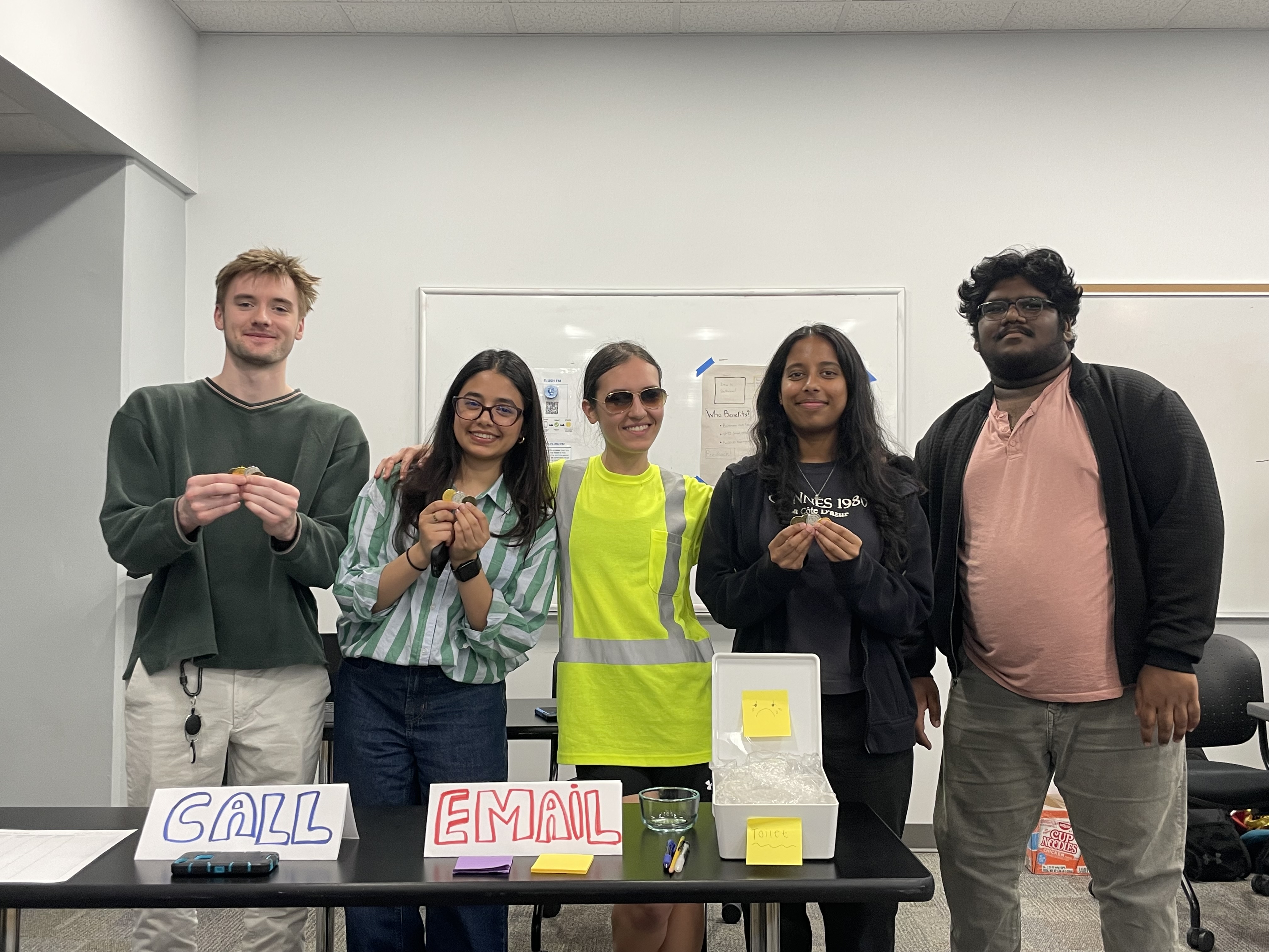
The FlushFM team after the final presentation

We (Marie, Senanga, Sreyansh, Connor, Aayusha) built FlushFM for INST406 in spring 2026.